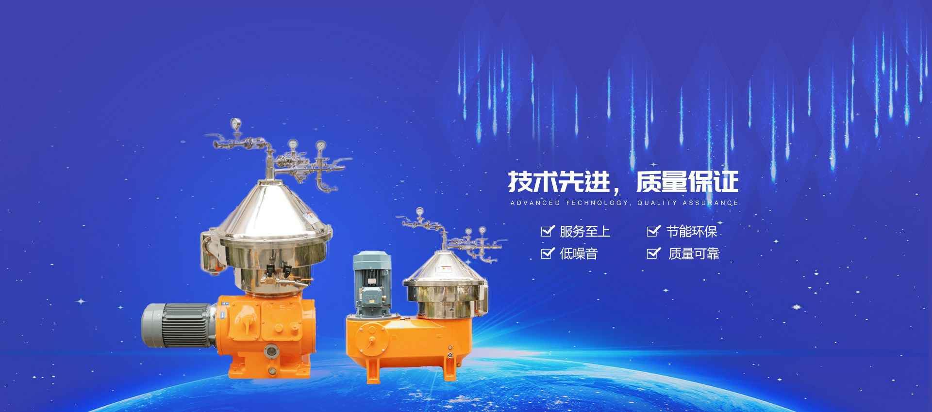
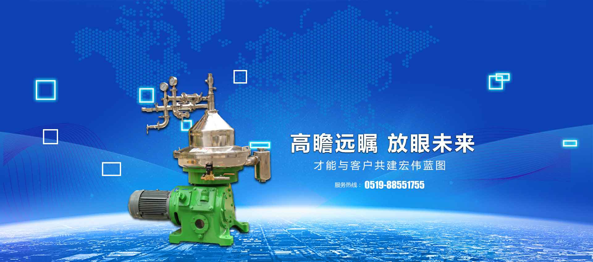
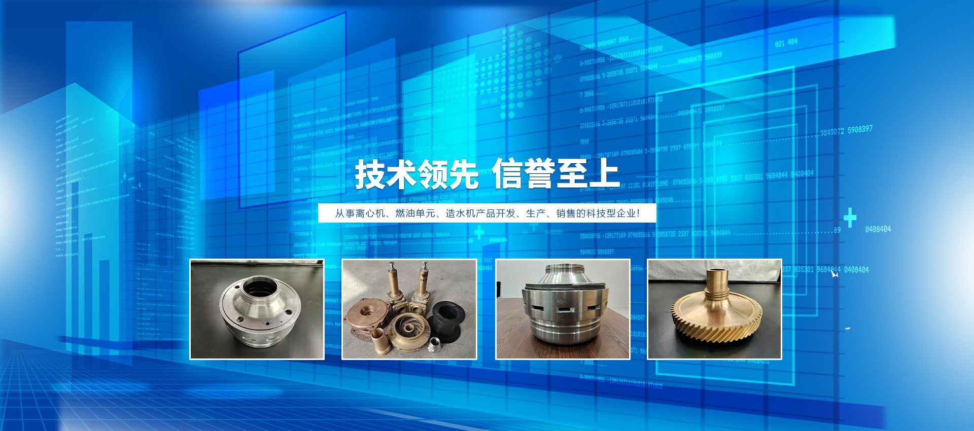
Home

above this sentence your page title is shown

this is #col1

* The Perfect 3 Column Liquid Layout (Percentage widths)

* No CSS hacks

* SEO friendly

* No Images

* No JavaScript

* Cross-browser & iPhone compatible

Percentage dimensions of the holy grail layout

Three column layout dimensions

All the dimensions are in percentage widths so the layout adjusts to any screen resolution. Vertical dimensions are not set so they stretch to the height of the content.

Maximum column content widths

To prevent wide content (like long URLs) from destroying the layout (long content can make the page scroll horizontally) the column content divs are set to overflow:hidden. This chops off any content that is wider than the div. Because of this, it's important to know the maximum widths allowable at common screen resolutions. For example, if you choose 800 x 600 pixels as your minimum compatible resolution what is the widest image that can be safely added to each column before it gets chopped off? Here are the figures:

800 x 600
* Left & right columns: 162 pixels
* Center page: 357 pixels
1024 x 768
* Left & right columns: 210 pixels
* Center page: 459 pixels
* iPad is 1024 wide

The nested div structure

I've colour coded each div so it's easy to see:

Three column layout nested div structure

The container is set to a min- and max-width.

The header, colmask (gives the right column its green background color) and footer divs are 100% wide and stacked vertically one after the other.

Colmid (gives the middle column its blue background color) is inside colmask and colleft (gives the left column its orange background color) is inside colmid.

The three column content divs (col1, col2 & col3) are inside colleft. Notice that the main content column (col1) comes before the other columns.

Included CMSMS "standards"

Included are
* accessibility
* horizontal CSS menu
* search
* breadcrumbs
* print
* relational links

below this sentence your content is shown

wCongratulations! The installation worked. You now have a fully functional installation of CMS Made Simple and you are almost ready to start building your site.

If you chose to install the default content, you will see numerous pages available to read. You should read them thoroughly as these default pages are devoted to showing you the basics of how to begin working with CMS Made Simple. On these example pages, templates, and stylesheets many of the features of the default installation of CMS Made Simple are described and demonstrated. You can learn much about the power of CMS Made Simple by absorbing this information.

To get to the Administration Console you have to login as the administrator (with the username/password you mentioned during the installation process) on your site at http://yourwebsite.com/cmsmspath/admin. If this is your site click here to login.

Read about how to use CMS Made Simple in the documentation(external link). In case you need any help the community is always at your service, in the forum(external link) or the IRC(external link).

License

CMS Made Simple is released under the GPL(external link) license and as such you don't have to leave a link back to us in these templates or on your site as much as we would like it.

Some third party add-on modules may include additional license restrictions.


this is #col2

No CSS hacks

The CSS used for this layout is 100% valid and IE hack free. This design uses percentage widths and clever relative positioning.

Valide CSS!

SEO friendly 2-1-3 column ordering

The higher up content is in your page code, the more important it is considered by search engine algorithms. Therefore your main page content must come before the side columns. This layout does exactly that: the center page comes first, then the left column and finally the right column (see the nested div structure diagram for more info).

Full length column background colours

In this layout the background colours of each column will always stretch to the length of the longest column.

No JavaScript

JavaScript is not required.

Resizable text compatible

This layout is fully compatible with resizable text. Resizable text is important for web accessibility. People who are vision impaired can make the text larger so it's easier for them to read.

No IE Conditional Comments

Only one stylesheet is used with this layout This means that IE conditional comments are not needed to set extra CSS rules for older versions of Internet Explorer. The very much outdated IE6 is not supported.

below this sentence your leftbar content is shown


this is #col3

This layout is FREE for anyone to use

The original design is by Matthew James Taylor.
It was revised for CMS Made Simple by Frank Hoek, January 2012.

Cleaning up the code of this template

Once you understand the way this template works, clean it up by removing all blocks of code from START: CONTENT TO BE REMOVED to END: CONTENT TO BE REMOVED.

Styling

The colors and margins in this design are meant only to show how the page is built. Of course you have to change all of that.

Browser Compatibility

This 3 column liquid Layout has been tested by Frank on the following browsers:

Windows

  • Firefox 9
  • Google Chrome 16
  • Internet Explorer 7, 8 & 9
  • Opera 11
  • Safari 5


and previously by Matthew on:

iPhone & iPod Touch

  • Safari


Mac

  • Firefox
  • Netscape 9.0.0.5 & 7.1
  • Opera 9.25
  • Safari


Valid XHTML Transitional markup

Valid XHTML 1.0 Transitional

Centered menus compatible

You may be interested in Matthew's cross-browser compatible centered menus.

below this sentence your rightbar content is shown